Far and away the most interesting idea of the new government college ratings emerges toward the end of the report. It doesn't quite square the circle of competing constituencies for the rankings I worries about in my last post, but it gets close. Lots of weight is
placed on a single magic model that will predict outcomes regardless
of all the confounding factors they raise (differing pay by gender,
sex, possibly even degree composition).
As an inveterate modeler and data hound, I can see
the appeal here. The federal government has far better data than US
News and World Report, in the guise of the student loan repayment
forms; this data will enable all sorts of useful studies on the
effects of everything from home-schooling to early-marriage. I don't
know that anyone is using it yet for the sort of studies it makes
possible (do you?), but it sounds like they're
opening the vault just for these college ranking purposes.
The challenges raised to the rankings in the report are formidable. Whether you think they can work depends on how much faith you have in the model. I think it's likely to be dicey for two reasons: it's hard to define "success" based on the data we have, and there are potentially disastrous downsides to the mix of variables that will be used as inputs.
Tuesday, December 30, 2014
Federal college rankings: who are they for?
Before the holiday, the Department of Education circulated a draft prospectus
of the new college rankings they hope to release next year.
That afternoon, I wrote a somewhat dyspeptic post on the way that these
rankings, like all rankings, will inevitably be gamed. But it's
probably better to bury that off and instead point out a couple looming problems
with the system we may be working under soon. The first is that the audience for these rankings is unresolved in a very problematic way; the second is that altogether two much weight is placed on a regression model solving every objection that has been raised. Finally, I'll lay out my
"constructive" solution for salvaging something out of this, which is
that rather than use a three-tiered "excellent" - "adequate" - "needs
improvement", everyone would be better served if we switched to a
two-tiered "Good"/"Needs Improvement" system. Since this is sort of
long, I'll break it up into three posts: the first is below.
Thursday, December 18, 2014
Administrative layers
Sometimes it takes time to make a data visualization, and sometimes they just fall out of the data practically by accident. Probably the most viewed thing I've ever made, of shipping lines as spaghetti strings, is one of the latter. I'm working to build one of the former for my talk at the American Historical Association out of the Newberry Library's remarkable Atlas of Historical County Boundaries. But my second ggplot with the set, which I originally did just to make sure the shapefiles were working, was actually interesting. So I thought I'd post it. Here's the graphic: then the explanation. Click to enlarge.

Tuesday, December 16, 2014
Fundamental plot arcs, seen through multidimensional analysis of thousands of TV and movie scripts
Note: a somewhat more complete and slightly less colloquial, but eminently more citeable, version of this work is in the Proceedings of the 2015 IEEE International Conference on Big Data. Plus, it was only there that I came around to calling the whole endeavor "plot arceology."
It's interesting to look, as I did at my last post, at the plot structure of typical episodes of a TV show as derived through topic models. But while it may help in understanding individual TV shows, the method also shows some promise on a more ambitious goal: understanding the general structural elements that most TV shows and movies draw from. TV and movies scripts are carefully crafted structures: I wrote earlier about how the Simpsons moves away from the school after its first few minutes, for example, and with this larger corpus even individual words frequently show a strong bias towards the front or end of scripts. These crafting shows up in the ways language is distributed through them in time.
So that's what I'm going to do here: make some general observations about the ways that scripts shift thematically. In its own, this stuff is pretty interesting--when I first started analyzing the set, I thought it might an end in itself. But it turns out that by combining those thematic scripts with the topic models, it's possible to do something I find really fascinating, and a little mysterious: you can sketch out, derived from the tens of thousands of hours of dialogue in the corpus, what you could literally call a plot "arc" through multidimensional space.
Words in screen time
First, let's lay the groundwork. Many, many individual words show strong trends towards the beginning or end of scripts. In fact, plotting movies in what I'm calling "screen time" usually has a much more recognizable signature than plotting things in the "historic time" you can explore yourself in the movie bookworm. So what I've done is cut every script there into "twelfths" of a movie or TV show; the charts here show the course of an episode or movie from the first minute at the left to the last one at the right. For example: the phrase "love you" (as in, mostly, "I love you") is most frequent towards the end of movies or TV shows: characters in movies are almost three times more likely to profess their love in the last scene of a movie than in the first.
Thursday, December 11, 2014
Typical TV episodes: visualizing topics in screen time
The most interesting element of the Bookworm browser for movies I wrote about in my last post here is the possibility to delve into the episodic structure of different TV shows by dividing them up by minutes. On my website, I previously wrote about story structures in the Simpsons and a topic model of movies I made using the general-purpose bookworm topic modeling extension. For a description of the corpus or of topic modeling, see those links.
Note: Part II of this series, which goes into quantifying the fundamental shared elements of plot arcs, is now up here.
In this post, I'm going to combine those two projects. What can we see by looking at the different content of TV shows? Are there elements to the ways that TV shows are laid out--common plot structures--that repeat? How thematically different is the end of a show from its beginning? I want to take a first stab at those questions by looking at a couple hundred TV shows and their structure. To do that, I:
1. Divided a corpus of 80,000 movies and TV show episodes into 3 minute chunks, and then divided each show into 12 roughly-equal parts.
2. Generated a 128-topic model where each document is one of those 3-minute chunks, which should help the topics be better geared to what's on screen at any given time.
3. For every TV show, plotted the distribution of the ten most common topics with the y-axis roughly representing percent of dialogue of the show in the topic, and the x-axis corresponding to the twelfth of the show it happened in. So dialogue in minute 55 of a 60-minute show will be in chunk 11.
First a note: these images seem not to display in some browsers. If you want to zoom and can't read the legends, right click and select "view in a new tab."
Let's start by looking at a particularly formulaic show: Law and Order.

The two most common topics in Law & Order are "court case Mr. trial lawyer" and "murder body blood case". Murder is strongest in the first twelfth, when the body is discovered; "court case" doesn't appear in any strength until almost halfway through, after which it grows until it takes up more than half the space by the last twelfth.
That's pretty good straight off: the process accurately captures the central structuring element of the show, which is the handoff from cops to lawyers at the 30 minute mark. (Or really, this suggests, more like the 25 minute mark). Most of the other topics are relatively constant. (It's interesting that the gun topic is constant, actually, but that's another matter). But a few change--we also get a decrease in the topic "people kid kids talk," capturing some element of the interview process by the cops; a different conversation topic, "talk help take problem," is more associated with the lawyers. Also, the total curve is wider at the end than at the beginning; that's because we're not looking at all the words in Law & Order, just the top ten out of 127 topics. We could infer, preliminarily, that Law and Order is more thematically coherent in the last half hour than the first one: there's a lot of thematic diversity as the detectives roam around New York, but the courtroom half is always the same.
Compare the spinoffs: SVU is almost identical to the Law & Order mothership, but Criminal Intent gets to the courtroom much later and with less intensity.


See below the fold for more. Be warned: I've put a whole bunch of images into this one.
Note: Part II of this series, which goes into quantifying the fundamental shared elements of plot arcs, is now up here.
In this post, I'm going to combine those two projects. What can we see by looking at the different content of TV shows? Are there elements to the ways that TV shows are laid out--common plot structures--that repeat? How thematically different is the end of a show from its beginning? I want to take a first stab at those questions by looking at a couple hundred TV shows and their structure. To do that, I:
1. Divided a corpus of 80,000 movies and TV show episodes into 3 minute chunks, and then divided each show into 12 roughly-equal parts.
2. Generated a 128-topic model where each document is one of those 3-minute chunks, which should help the topics be better geared to what's on screen at any given time.
3. For every TV show, plotted the distribution of the ten most common topics with the y-axis roughly representing percent of dialogue of the show in the topic, and the x-axis corresponding to the twelfth of the show it happened in. So dialogue in minute 55 of a 60-minute show will be in chunk 11.
First a note: these images seem not to display in some browsers. If you want to zoom and can't read the legends, right click and select "view in a new tab."
Let's start by looking at a particularly formulaic show: Law and Order.
The two most common topics in Law & Order are "court case Mr. trial lawyer" and "murder body blood case". Murder is strongest in the first twelfth, when the body is discovered; "court case" doesn't appear in any strength until almost halfway through, after which it grows until it takes up more than half the space by the last twelfth.
That's pretty good straight off: the process accurately captures the central structuring element of the show, which is the handoff from cops to lawyers at the 30 minute mark. (Or really, this suggests, more like the 25 minute mark). Most of the other topics are relatively constant. (It's interesting that the gun topic is constant, actually, but that's another matter). But a few change--we also get a decrease in the topic "people kid kids talk," capturing some element of the interview process by the cops; a different conversation topic, "talk help take problem," is more associated with the lawyers. Also, the total curve is wider at the end than at the beginning; that's because we're not looking at all the words in Law & Order, just the top ten out of 127 topics. We could infer, preliminarily, that Law and Order is more thematically coherent in the last half hour than the first one: there's a lot of thematic diversity as the detectives roam around New York, but the courtroom half is always the same.
Compare the spinoffs: SVU is almost identical to the Law & Order mothership, but Criminal Intent gets to the courtroom much later and with less intensity.
See below the fold for more. Be warned: I've put a whole bunch of images into this one.
Monday, September 15, 2014
Screen time!
Here's a very fun, and for some purposes, perhaps, a very useful thing: a Bookworm browser that lets you investigate onscreen language in about 87,000 movies and TV shows, encompassing together over 600 million words. (Go follow that link if you want to investigate yourself).
I've been thinking about doing this for years, but some of the interest in my recent Simpsons browser and some leaps and bounds in the Bookworm platform have spurred me to finally lay it out. This comes from a very large collection of closed captions/subtitles from the website opensubtitles.org; thanks very much to them for providing a bulk download.
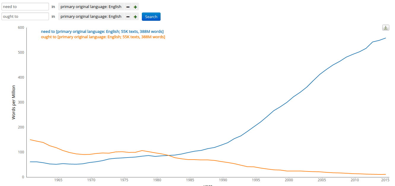
Just as a set of line charts, this provides a nice window into changing language. I've been interested in the "need to"/"ought to" shift since I wrote about it in Mad Men: it's quite clear in the subtitle corpus, and the ratio is much higher as of 2014 than anything Ngrams can show.
I've been thinking about doing this for years, but some of the interest in my recent Simpsons browser and some leaps and bounds in the Bookworm platform have spurred me to finally lay it out. This comes from a very large collection of closed captions/subtitles from the website opensubtitles.org; thanks very much to them for providing a bulk download.
Just as a set of line charts, this provides a nice window into changing language. I've been interested in the "need to"/"ought to" shift since I wrote about it in Mad Men: it's quite clear in the subtitle corpus, and the ratio is much higher as of 2014 than anything Ngrams can show.
 |
| Add caption |
Thursday, September 11, 2014
Some links to myself
An FYI, mostly for people following this feed on RSS: I just put up on my home web site a post about applications for the Simpsons Bookworm browser I made. It touches on a bunch of stuff that would usually lead me to post it here. (Really, it hits the Sapping Attention trifecta: a discussion of the best ways of visualizing Dunning Log-Likelihood, cryptic allusions to critical theory; and overly serious discussions of popular TV shows.). But it's even less proofread and edited than what I usually put here, and I've lately been more and more reluctant to post things on a Google site like this, particularly as blogger gets folded more and more into Google Plus. That's one of the big reasons I don't post here as much as I used to, honestly. (Another is that I don't want to worry about embedded javascript). So, head over there if you want to read it.
While I'm at it, I made a few data visualizations last year that I only shared on Twitter, but meant to link to from here: Those are linked from a single place on my web site. My favorite is the baseball leaderboard, the most popular was either the distorted subway maps or the career charts, and the most useful, I think, is the browser of college degrees by school and institution type. There are a couple others as well. (And there are a few not there that I'll add at some point.)
While I'm at it, I made a few data visualizations last year that I only shared on Twitter, but meant to link to from here: Those are linked from a single place on my web site. My favorite is the baseball leaderboard, the most popular was either the distorted subway maps or the career charts, and the most useful, I think, is the browser of college degrees by school and institution type. There are a couple others as well. (And there are a few not there that I'll add at some point.)
Wednesday, August 13, 2014
Data visualization rules, 1915
Right now people in data visualization tend to be interested in their field’s history, and people in digital humanities tend to be fascinated by data visualization. Doing some research in the National Archives in Washington this summer, I came across an early set of rules for graphic presentation by the Bureau of the Census from February 1915. Given those interests, I thought I’d put that list online.
As you may know, the census bureau is probably the single most important organization for inculcating visual-statistical literacy in the American public, particularly through the institution of the Statistical Atlas of the United States published in various forms between 1870 and 1920.
As you may know, the census bureau is probably the single most important organization for inculcating visual-statistical literacy in the American public, particularly through the institution of the Statistical Atlas of the United States published in various forms between 1870 and 1920.
 |
| A page from the 1890 Census Atlas: Library of Congress |
Friday, May 23, 2014
Mind the gap: Incomes, college majors, gender, and higher ed reform
People love to talk about how "practical" different college majors are: and practicality is usually majored in dollars. But those measurements can be very problematic, in ways that might have bad implications for higher education. That's what this post is about.
I'll start with a paradox that anyone who talks to young people about their college majors should understand.
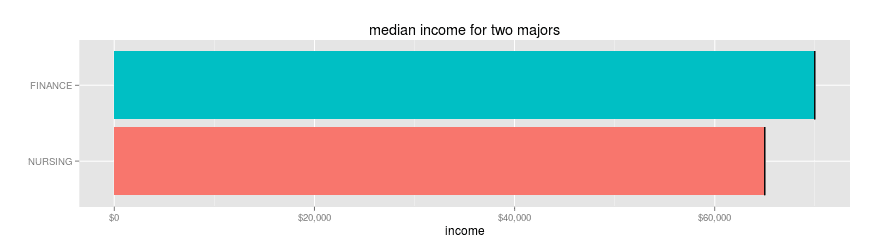
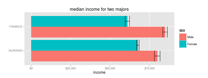
Let's say you're going to college to maximize your future earnings. You've read the census report that says your choice of major can make millions of dollars of difference, so you want to pick the right one. In the end, you're deciding between majoring in finance or nursing. Which one makes you more money?
Correction, 5/24/14: I've just realized I made an error in assigning weights that meant the numbers I gave originally in this post were for heads of household only, not all workers. I'm fixing the text with strikethroughs, because that's what people seem to do, and adding new charts while shrinking the originals down dramatically. None of the conclusions are changed by the mistake.
The obvious thing to do is look at median incomes in each field. Limiting to those who work 30hrs a week and are between 30 and 45 years old, you'd get these results. (Which is just the sort of thing that census report tells you).
Nursing majors make a median of $69,000 $65,000; finance majors make $78,000$70,000.
That means you'll make13% more as a finance major, right?
Wrong. This is pretty close, instead, to a straightforward case of Simpson's Paradox.* Even though the average finance major makes more than the average nursing major, the average individual will make more in nursing. Read that sentence again: it's bizarre, but true.
How can it be true? Because any individual has to be male or female. (Fine, not really: but for the purposes of government datasets like this, you have to choose one). And when you break down pay by gender, something strange happens:
Male nurses do indeed make less than male finance majors ($72,00085,000 vs $76,00080,000 in median income).
But that's more than offset by the fact that female nurses make much more than their finance counterparts ($64,00067,699.78** vs $57,00061,000). The average person will actually make more with a nursing degree than with finance degree.
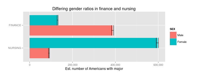
So why the difference? Because there are hardly any men who major in nursing, and hardly any women who major in finance, so the median income ends up being about male wages for finance, and about female wages for nursing.
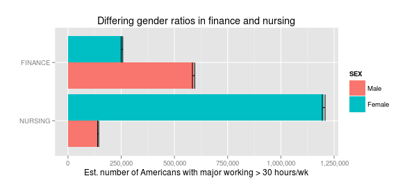
The apparent gulf between finance and nursing has nothing to do with the actual majors, and everything to do with the pervasive gender gaps across the American economy.
Like many examples of Simpson's paradox, this has some real-world implications. There's a real push (that census report is just one example) to think of college majors more vocationally. Charts of income by major are omnipresent. There's even a real danger that universities will get some federal regulation using loan repayment rates, which won't be independent of income, to determine what colleges are doing a "good" or "bad" job.
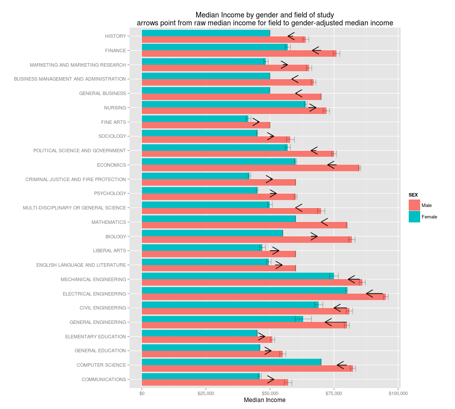
Every newspaper chart or college loan program that doesn't disaggregate by gender is going to make the majors that women choose look worse than the ones that men choose. Think we need more people to major in computer science, engineering, and economics? Think we need fewer sociology, English, and Liberal Arts majors? That's not just saying that high-paying fields are better: it's also saying that the sort of fields women major in more often are less worthwhile.
How important is gender? Very. A male English majorprobably makes more than makes the same as a female math major, and a female economics major makes less than a male history major. So the next time you see someone arguing that only fools major in art history, remind them that the real thing holding back most English majors in the workplace isn't their degree but systemic discrimination against their sex in the American economy.***
By the way: you might be thinking, "That's great: the ACS includes major, now we have some real evidence." You shouldn't. Data collection isn't apolitical. The reason that the ACS includes major is because the state has turned its gaze to college major as a conceivable area of government regulation. We're going to get a lot of thoughtlessly anti-humanities findings out of this set: For example, that census department report grandly concluded that people who major in the humanities are much less likely to find full-time, year-round employment, while burying in a footnote that schoolteachers--the top or second-most common job for most humanities majors--don't count as year-round employees because they take the summer off. **** So, brace yourself. One of the big red herrings will be focusing on earnings for 23-year-olds; this ignores both the fact that law (which you can't start until age 26) is a common and lucrative destination for humanities majors, but also that liberal arts majors catch up, since their skills (to speak of it instrumentally) don't atrophy as quickly. Not to mention all the non-pecuniary rewards.*****
So one of the big challenges over the next few years for advocates of fields that include a lot of women (which includes psychology, education, and communication, as well as many of the humanities) is going to be sussing out the implication of the gender gap for proposed policies and regulations. A perfectly crafted higher ed policy would, of course, take this into account: but it's extremely unlikely that we'll get one of those, if indeed we need one. It would be a bitterly ironic outcome if attempts to fix college majors ended up rewarding fields like computer science for becoming systematically less friendly to women over the last few decades.
This isn't to say there aren't real effects: pharmacology and electrical engineering majors do make more money, certainly, than arts or communications majors. But while the gender disparity is a massive, critical element to every discussion of wages, it's not the only thing lurking behind these numbers. (I've only imperfected adjusted for age, for example).
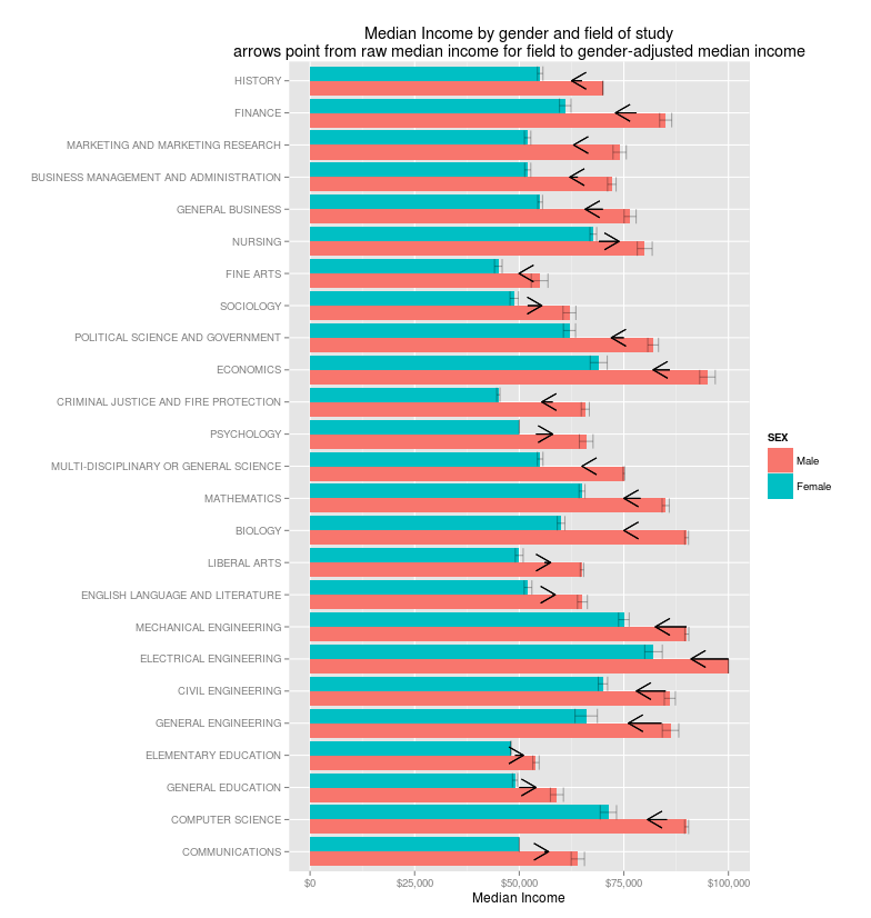
So I'm reluctant to give the average incomes at all, since I suspect that even with gender factored out they might confuse us. Still, it's worth thinking about. So here they are: a chart of the most common majors, showing median income for men and women: the arrows show the shift from the actual median income to what it would be if both genders were equally represented.
*Actually, this isn't a perfect case of Simpson's paradox, because the male rate is indeed lower; there's a third variable at play here, the size of the gender gap within each field: although it's everywhere, the gender gap isn't necessarily the same size.
**Median incomes usually come out as round numbers, because most people report it approximately; but sometimes, as here, they don't.
**** That's why I've made the somewhat questionable choice of not reducing the set down to "full time year round" workers as is conventional: instead, I'm using the weaker filter of persons under 60 with a college degree who worked at least 30 hours a week.
***** Which, yes, I believe are more important than the few thousand dollars you might get by agreeing to sell pharmaceuticals the rest of your life. But it's critically important not to just cede the field on less exalted measured of success.
I'll start with a paradox that anyone who talks to young people about their college majors should understand.
Let's say you're going to college to maximize your future earnings. You've read the census report that says your choice of major can make millions of dollars of difference, so you want to pick the right one. In the end, you're deciding between majoring in finance or nursing. Which one makes you more money?
Correction, 5/24/14: I've just realized I made an error in assigning weights that meant the numbers I gave originally in this post were for heads of household only, not all workers. I'm fixing the text with strikethroughs, because that's what people seem to do, and adding new charts while shrinking the originals down dramatically. None of the conclusions are changed by the mistake.
 |
| Original version |
 |
| Same chart, all workers |
That means you'll make
Wrong. This is pretty close, instead, to a straightforward case of Simpson's Paradox.* Even though the average finance major makes more than the average nursing major, the average individual will make more in nursing. Read that sentence again: it's bizarre, but true.
How can it be true? Because any individual has to be male or female. (Fine, not really: but for the purposes of government datasets like this, you have to choose one). And when you break down pay by gender, something strange happens:
 |
| Original version, head of household only |
 |
Male nurses do indeed make less than male finance majors ($72,000
But that's more than offset by the fact that female nurses make much more than their finance counterparts ($64,000
So why the difference? Because there are hardly any men who major in nursing, and hardly any women who major in finance, so the median income ends up being about male wages for finance, and about female wages for nursing.
 |
| Original version, heads of household only. |
The apparent gulf between finance and nursing has nothing to do with the actual majors, and everything to do with the pervasive gender gaps across the American economy.
Like many examples of Simpson's paradox, this has some real-world implications. There's a real push (that census report is just one example) to think of college majors more vocationally. Charts of income by major are omnipresent. There's even a real danger that universities will get some federal regulation using loan repayment rates, which won't be independent of income, to determine what colleges are doing a "good" or "bad" job.
Every newspaper chart or college loan program that doesn't disaggregate by gender is going to make the majors that women choose look worse than the ones that men choose. Think we need more people to major in computer science, engineering, and economics? Think we need fewer sociology, English, and Liberal Arts majors? That's not just saying that high-paying fields are better: it's also saying that the sort of fields women major in more often are less worthwhile.
How important is gender? Very. A male English major
By the way: you might be thinking, "That's great: the ACS includes major, now we have some real evidence." You shouldn't. Data collection isn't apolitical. The reason that the ACS includes major is because the state has turned its gaze to college major as a conceivable area of government regulation. We're going to get a lot of thoughtlessly anti-humanities findings out of this set: For example, that census department report grandly concluded that people who major in the humanities are much less likely to find full-time, year-round employment, while burying in a footnote that schoolteachers--the top or second-most common job for most humanities majors--don't count as year-round employees because they take the summer off. **** So, brace yourself. One of the big red herrings will be focusing on earnings for 23-year-olds; this ignores both the fact that law (which you can't start until age 26) is a common and lucrative destination for humanities majors, but also that liberal arts majors catch up, since their skills (to speak of it instrumentally) don't atrophy as quickly. Not to mention all the non-pecuniary rewards.*****
So one of the big challenges over the next few years for advocates of fields that include a lot of women (which includes psychology, education, and communication, as well as many of the humanities) is going to be sussing out the implication of the gender gap for proposed policies and regulations. A perfectly crafted higher ed policy would, of course, take this into account: but it's extremely unlikely that we'll get one of those, if indeed we need one. It would be a bitterly ironic outcome if attempts to fix college majors ended up rewarding fields like computer science for becoming systematically less friendly to women over the last few decades.
This isn't to say there aren't real effects: pharmacology and electrical engineering majors do make more money, certainly, than arts or communications majors. But while the gender disparity is a massive, critical element to every discussion of wages, it's not the only thing lurking behind these numbers. (I've only imperfected adjusted for age, for example).
So I'm reluctant to give the average incomes at all, since I suspect that even with gender factored out they might confuse us. Still, it's worth thinking about. So here they are: a chart of the most common majors, showing median income for men and women: the arrows show the shift from the actual median income to what it would be if both genders were equally represented.
 |
| Original version: heads of household only. |
*Actually, this isn't a perfect case of Simpson's paradox, because the male rate is indeed lower; there's a third variable at play here, the size of the gender gap within each field: although it's everywhere, the gender gap isn't necessarily the same size.
**Median incomes usually come out as round numbers, because most people report it approximately; but sometimes, as here, they don't.
***I don't actually recommend you do precisely that, from a lobbying perspective.
**** That's why I've made the somewhat questionable choice of not reducing the set down to "full time year round" workers as is conventional: instead, I'm using the weaker filter of persons under 60 with a college degree who worked at least 30 hours a week.
***** Which, yes, I believe are more important than the few thousand dollars you might get by agreeing to sell pharmaceuticals the rest of your life. But it's critically important not to just cede the field on less exalted measured of success.
Thursday, April 3, 2014
Biblio bizarre: who publishes in Google Books
Here's a little irony I've been meaning to post. Large scale book digitization makes tools like Ngrams possible; but it also makes tools like Ngrams obsolete for the future. It changes what a "book" is in ways that makes the selection criteria for Ngrams—if it made it into print, it must have some significance—completely meaningless.
So as interesting as Google Ngrams is for all sorts of purposes, it seems it might always end right in 2008. (I could have sworn the 2012 update included through 2011 in some collections; but all seem to end in 2008 now.)
Lo: the Ngram chart of three major publishers, showing the percentage of times each is mentioned compared to all other words in the corpus:
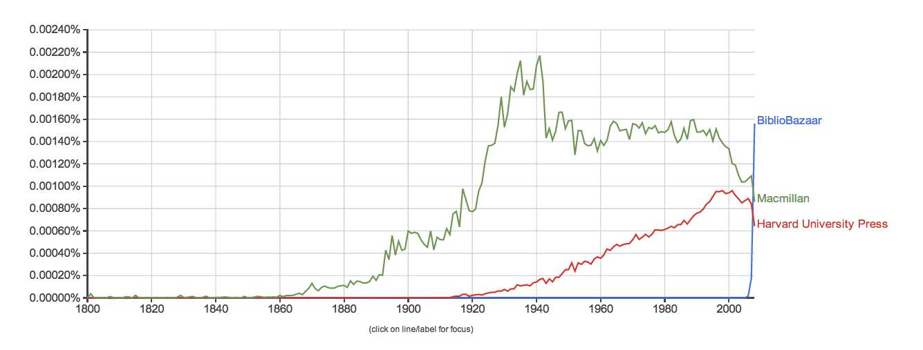
Monday, March 31, 2014
Shipping maps and how states see
A map I put up a year and a half ago went viral this winter; it shows the paths taken by ships in the US Maury collection of the ICOADS database. I've had several requests for higher-quality versions: I had some up already, but I just put up on Flickr a basically comparable high resolution version. US Maury is "Deck 701" in the ICOADS collection: I also put up charts for all of the other decks with fewer than 3,000,000 points. You can page through them below, or download the high quality versions from Flickr directly. (At the time of posting, you have to click on the three dots to get through to the summaries).
I've also had a lot of questions about modern day equivalents to that chart. This, it turns out, is an absolutely fascinating question, because it forces a set of questions about what the Maury chart actually shows. Of course, on the surface, it seems to show 19th century shipping routes: that's the primary reason it's interesting. But it's an obviously incomplete, obviously biased, and obviously fragmentary view of those routes. It's a relatively complete view, on the other hand, of something more restricted but nearly as interesting: the way that the 19th century American state was able to see and take measure of the world. No one, today, needs to be told that patterns of state surveillance, data collection, and storage are immensely important. Charts like these provide an interesting and important locus for seeing how states "saw," to commandeer a phrase from James Scott.
So I want to explore a couple of these decks as snapshots of state knowledge that show different periods in the ways states collected knowledge as data. In my earlier pieces on shipping, I argued that data narratives should eschew individual stories to describe systems and collectives. States are one of the most important of these collectives, and they have a way of knowing that is at once far more detailed and far more impoverished than the bureaucrats who collect for them. These data snapshots are fascinating and revealing snapshots of how the state used to and continues to pull in information from the world. (More practically, this post is also a bit of mulling over some questions for talks I'll be giving at the University of Nebraska on April 11 and the University of Georgia on April 22st--if you're in either area, come on down. Some of the unanswered questions may be filled in by then.)
Subscribe to:
Posts (Atom)